SubClipper
Are your subscriptions unorganized and costing you tons of money?
It's time to clip and manage your subscriptions.
Duration
One month | 9 hours
Role
UX/UI Researcher | Designer
Tools
Figma | Miro | Marvel
Problem
Currently the subscriptions dashboard is only available on desktop and reaches a limited number of people. The company would like to expand their market reach through mobile applications.
Solution
Creating a mobile version of the desktop app that helps users within the target audience keep track of all subscriptions and services while also having the ability to modify services.
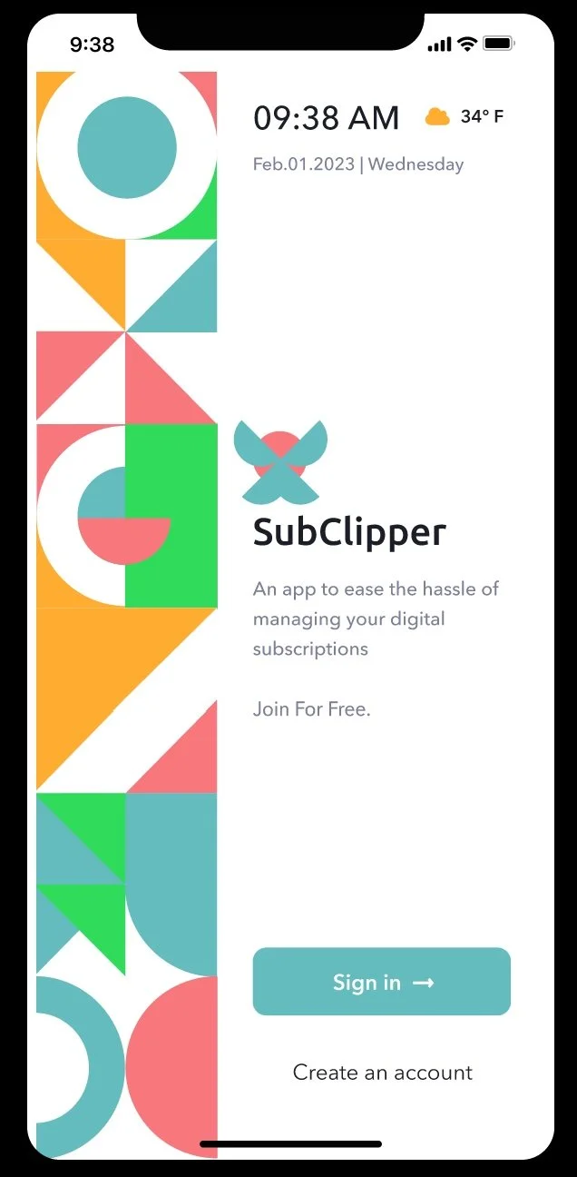
SubClipper Prototype
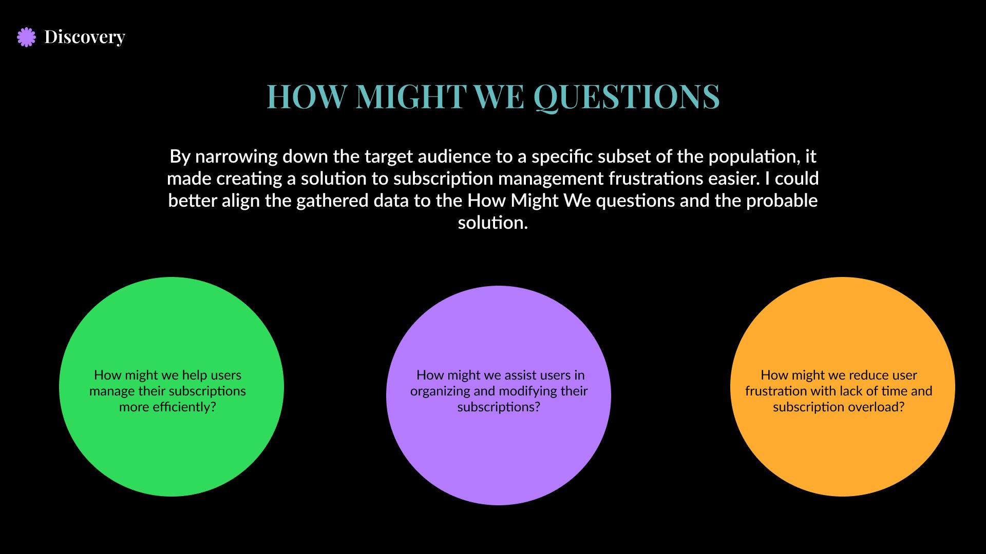
I chose to prototype using Figma, since it was a recommended app that can generate design fairly quickly and produce great results. Using the personas, HMWs, and sketches, I focused on providing users with information regarding the subscriptions and allowing users to manage them,
Regarding the process, I overall enjoy using Figma for prototypes as it allowed me to create high-fidelity screens with smooth screen transitions and interactable objects. While some screens were more of a challenge to design than others, the time constraints forced me to choose a design and stick with it, rather than iterating on possible ideas.
Business Goals
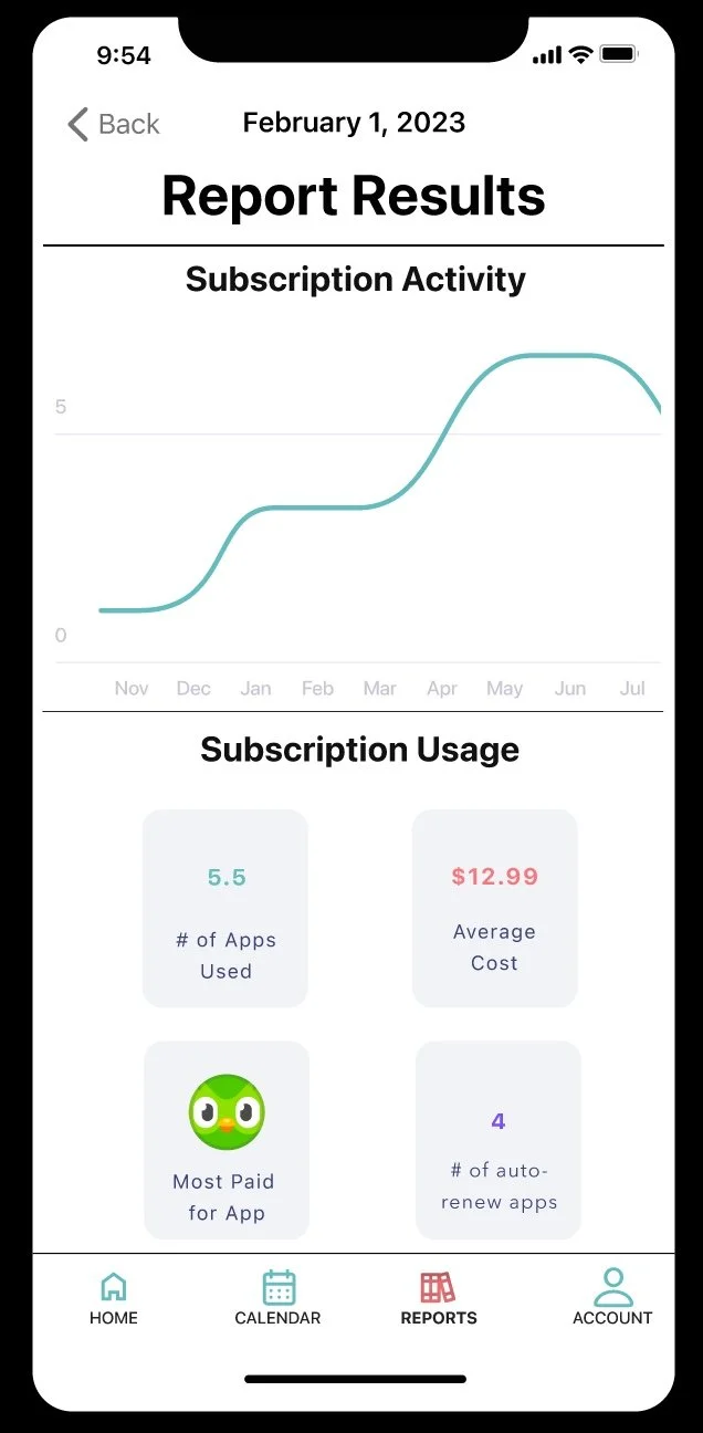
Display all of the consumer’s subscriptions in one place so that they can get a comprehensive view of their spending on subscriptions
As a returning users, consumers want to unsubscribe from a subscription so that they can reduce needless spending
Notify consumers of if any of their subscriptions are about to be auto-renewed so that they can make a decision about if they want to renew the subscription and continue spending money
Exploring the Problem Space
The increasingly popular trend of streaming everything and cutting cords have helped subscription models thrive. In addition to popular trends, world demand for more technology reliance due a global pandemic led to a boom in subscriptions.
Project Plan
Research Plan
When beginning this process, I was initially overwhelmed with the workload. I decided to create a succinct project plan to better organize each step and manage my time effectively.
Competitive Analysis
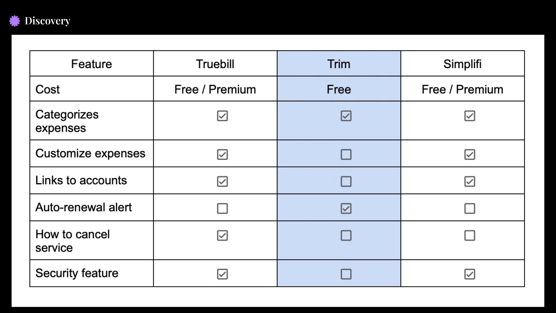
To better understand the industry and needs of users, I researched similar companies including Truebill, Trim, and Simplifi. I organized features each company offered in the following table:
Elements I would like to include:
→ Cost analysis
→ Security features
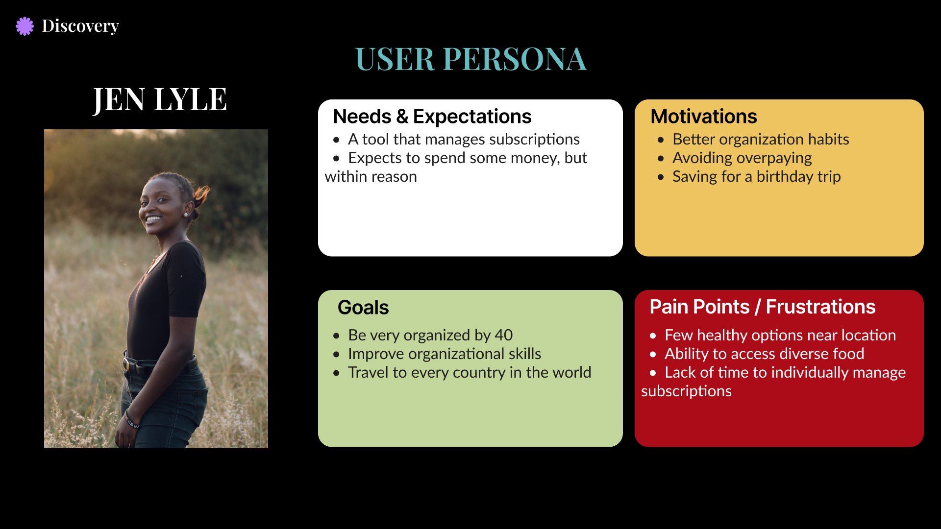
User Persona
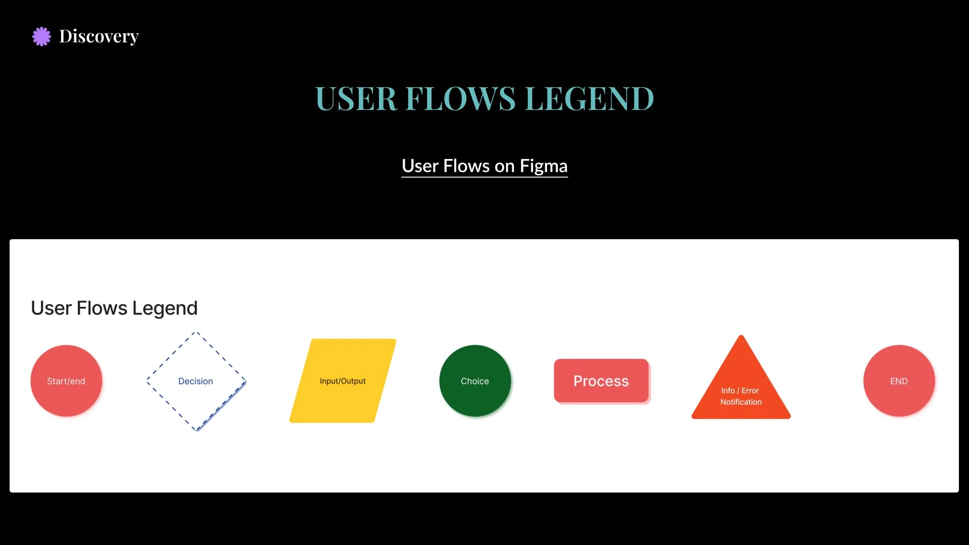
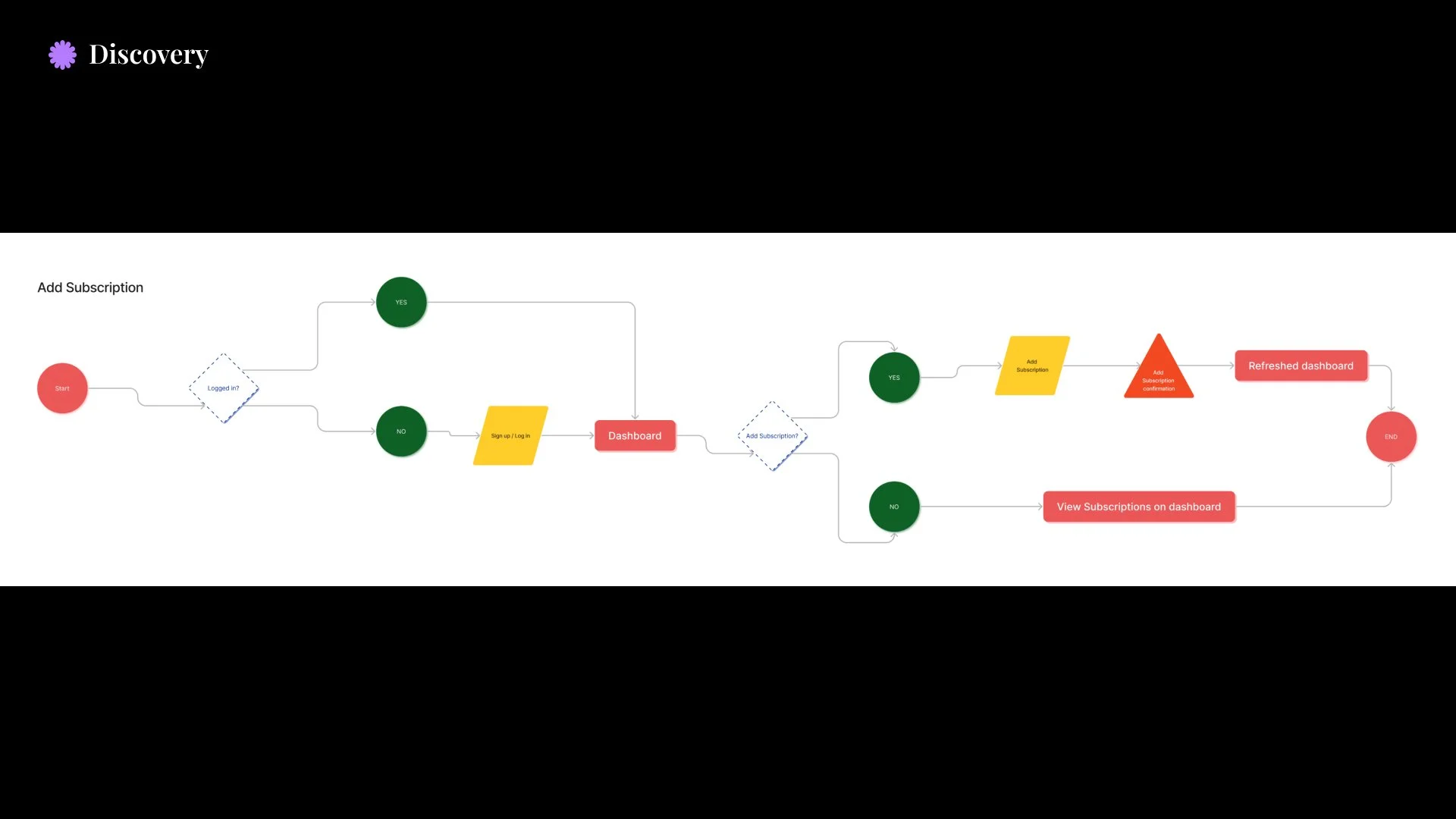
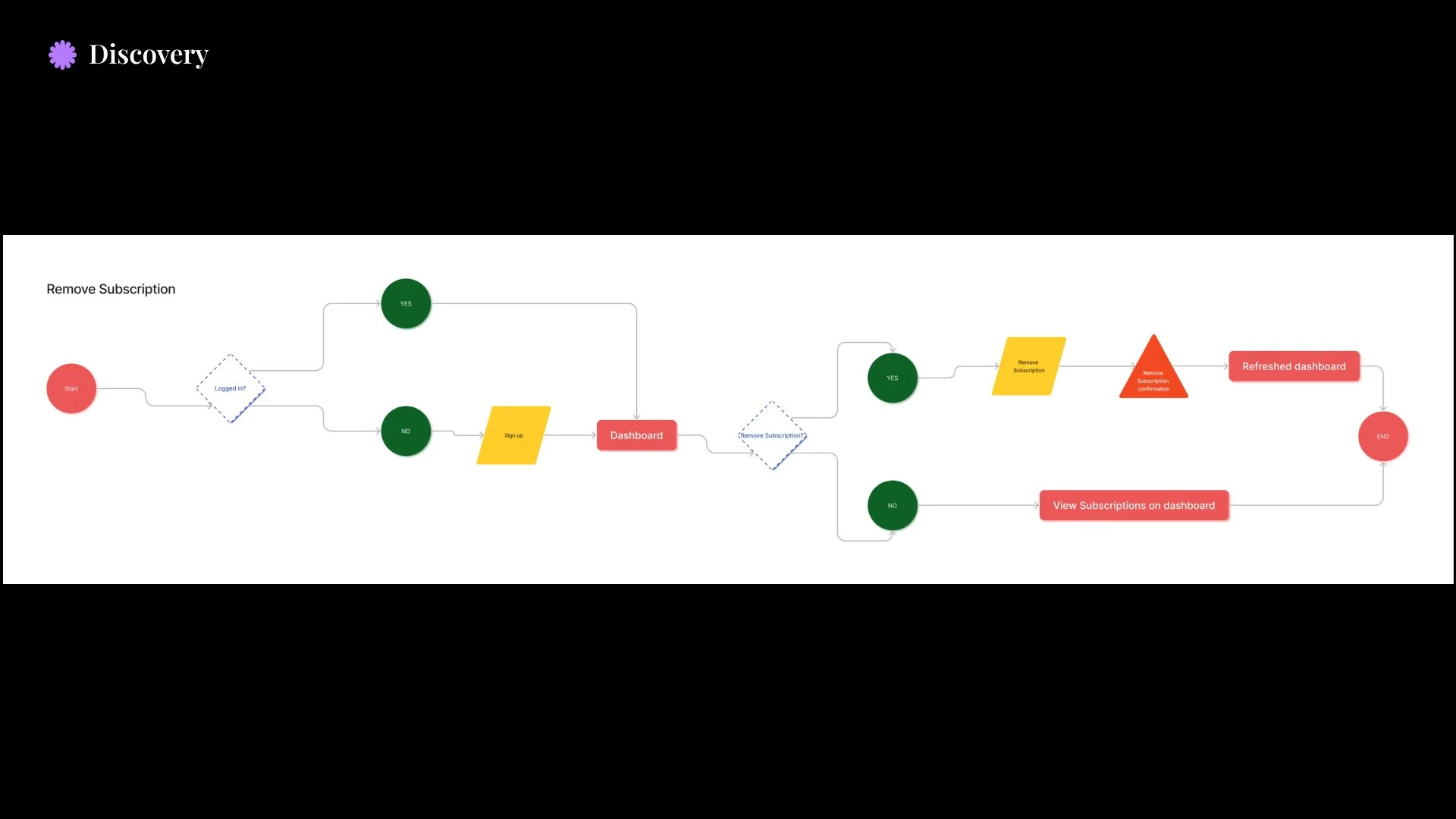
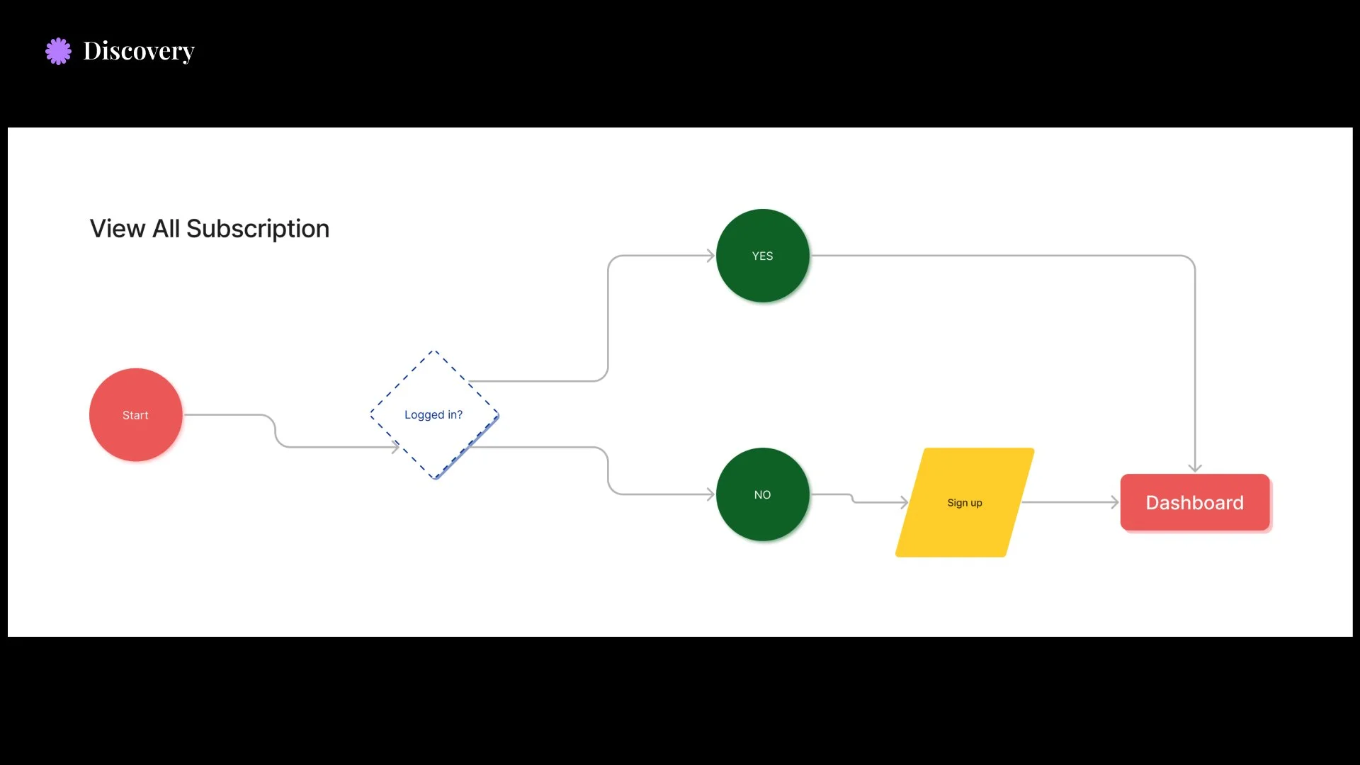
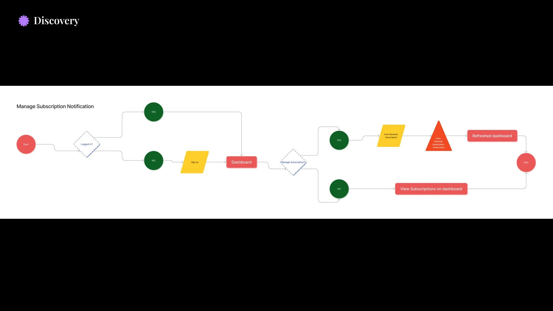
User Flows
The primary goal of the user flows was to create a minimalistic visual representation that mapped out each objective. With the user flows I am defining the process users could encounter and work through.
Need a closer look?
Wireframes
I sketched out my ideas of what I thought would be a good example of subscription management. I spent longer than planned on this portion due to overthinking specific elements. Eventually I narrowed down my focus and created the primary screens below:
Interactions Based on User Feedback
“The menu options are pretty good, but they could be more clear.”
“This would make saving money a blast!”
“Why would I need two menus?”
Feedback Implementation
Some users found the bottom navigation bar hard to understand, and it was not clear which
page they were on. The colors I originally chose caused accessibility issues and were not clear to users. I referenced the Human Interface Guidelines to improve the design. Here are the adjustments I implemented:
Feedback Implementation
Usability Testing
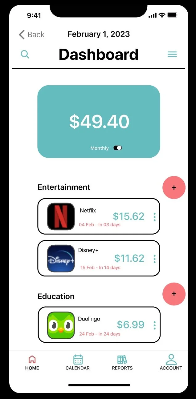
After conducting this round of testing, I determined some of my functionality was not 100% clear and concise. For example, in the following dashboard menu screen, I had extra buttons for users to use when common practice does not call for it.
I made changes similar to this to improve user usability and readability within the app. I also removed extra screens (like a second sign up screen) because of repetition.
User Insights:
All users found value and usefulness in the product and expressed desire in using such organization skills for other services.
The second round of testing that implemented changes proved to be successful and helpful.
100% of users were successful in completing the provided goals with clarity and ease of use.


Developing my Style
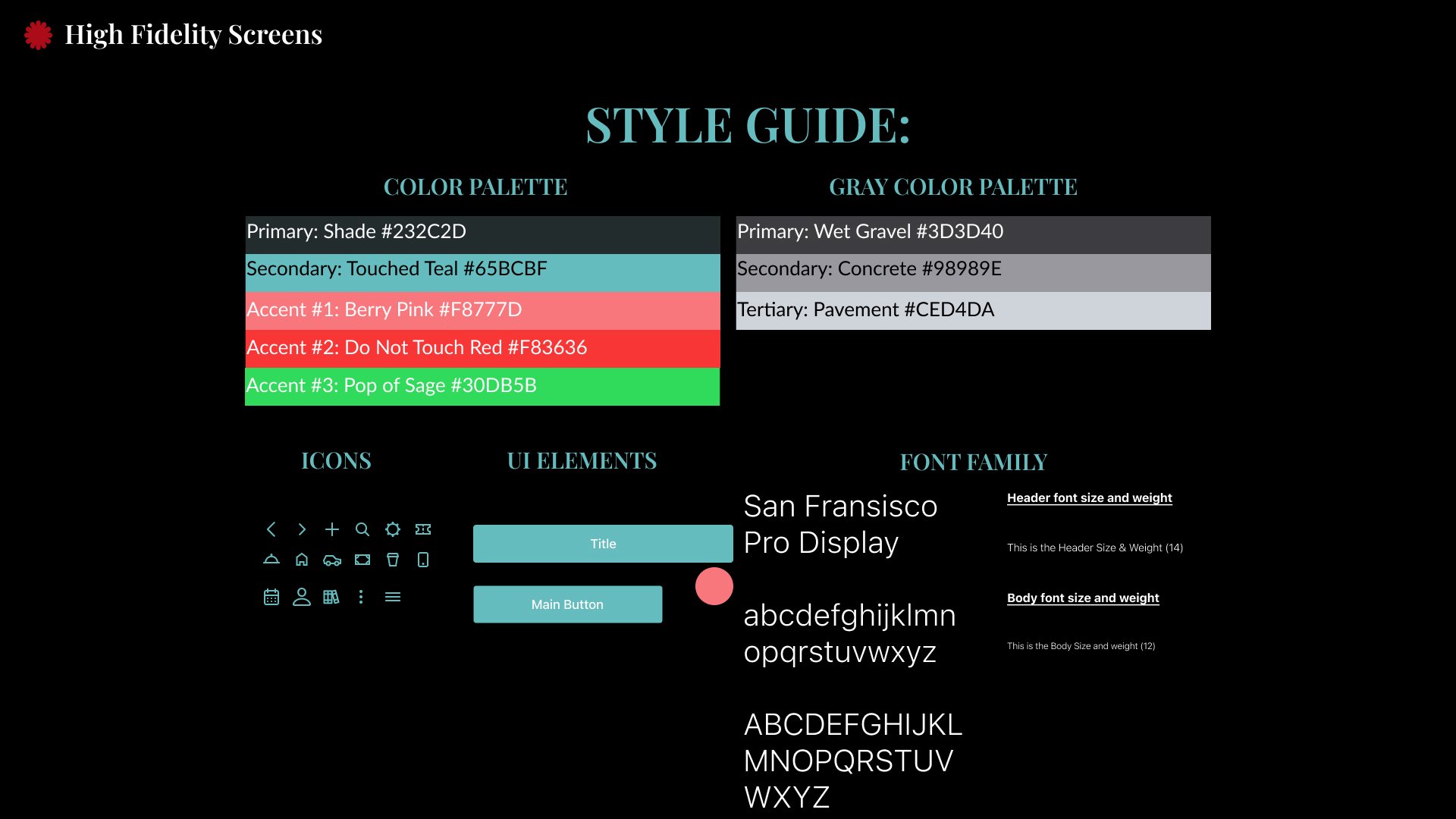
I wanted to keep in mind that many users wanted something familiar but highly engaging. The colors I chose are both energetic and familiar. I wanted a more comfortable and fun looking that make users more excited about using the app compared to a normal pen and paper planner.
Usability Testing
I gave users 4 tasks to complete:
1. Access your subscriptions
2. Cancel your most expensive subscription
3. Turn off Auto-Renew
4. Modify Subscription schedule
The primary goal for this test was to identify any potential navigation or usability conflicts. This round of testing was to take place after adjusting some minor complications. I wanted to make sure users could use the app with ease and understood the app’s purpose.
The Results
Users agreed the app’s color choices were appropriately engaging and trustworthy. Majority of the users in the test enjoyed the clear language and and near seamless screen navigation. A few users mentioned missing elements such as the ability to add an app’s name to a new subscription.
I found that after these tests many users enjoyed the organization, but found it potentially frustrating to add each subscription one by one. Overall they found the app useful and made their subscription organization easier.

Final Thoughts
This entire process over the course of the study was very much enjoyable and felt valuable to users. I loved working with a new challenge. Here are a few takeaways from the project:
1. I found that having more constraints can be easier and leave room for more creativity. Aligning to business needs can be helpful to users.
2. Accessibility is still something I personally struggle with, especially since one of the parameters of the specific project had the attributes of “friendly” and “casual”. Most times when hearing these two words I think brighter colors, which are not always compliant.
3. Not reinventing the wheel and using what was provided did help smooth over many roadblocks I encountered. Time restrictions did help motivate me to stay on task and control the creative tangents.
What’s Next?
As a result of testing and reviewing the final prototype, I found a few things that will need to be updated in the future. I will prioritize two issues: search feature and fine tuning calendar tab.
-
Issue: Many users wanted top search for specific apps. When clicking the magnifying glass, nothing occurred.
Next Steps: Create search feature to improve usability and navigation
-
Issue: While navigating to this part of the app was simple for users, some mentioned they needed more features - such as modifying subscriptions and editing dates - to get the most use.
Next Steps: Adding features - such as links to subscription modification and basic calendar features.
