Privato
Need help building your physical fitness business or finding clients?
Duration
5-6 Weeks | 40+ hours
Role
UX/UI Designer
Tools
Figma | Miro

Meet the Team
-
Analisa Esther
-

Joyce Han
-

Jack Dolan
-

Joyce Chun-Kim

Problem
Fitness experts need help to grow and scale their business faster and easily attain entrepreneurship.
Solution
Creating a mobile version of the desktop app that closes the gap between technical expert and business expert so that they can deliver transformational experience for their clients.

Privato Prototype
The team chose to use Figma for our prototype because it makes for a smooth transition process for both our needs, and when handing off to the next design team.
Figma makes interactive prototyping near-seamless and convenient.
Business Goals
Privato aims to help fitness experts grow and scale their business faster and easily attain entrepreneurship by closing the gap between technical expert and business expert so that they can deliver transformational experience for their clients.

Project Plan
1. Conduct research on marketplace and users (expert side) to understand main needs and current pain points.
2. Ideate and build red route prototype for potential platform that experts will use.

Exploring the Problem Space
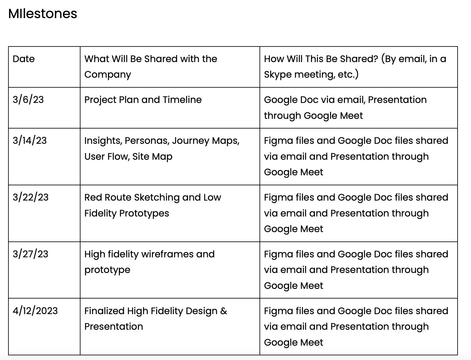
The increased need for personal trainers wanting to develop and grow their own business has prompted the need for a helpful foundation. The stakeholder provided several problems and solution combinations. As a team and collaborating with the stakeholder, we reduced the gap between a trainer’s business needs and clients.
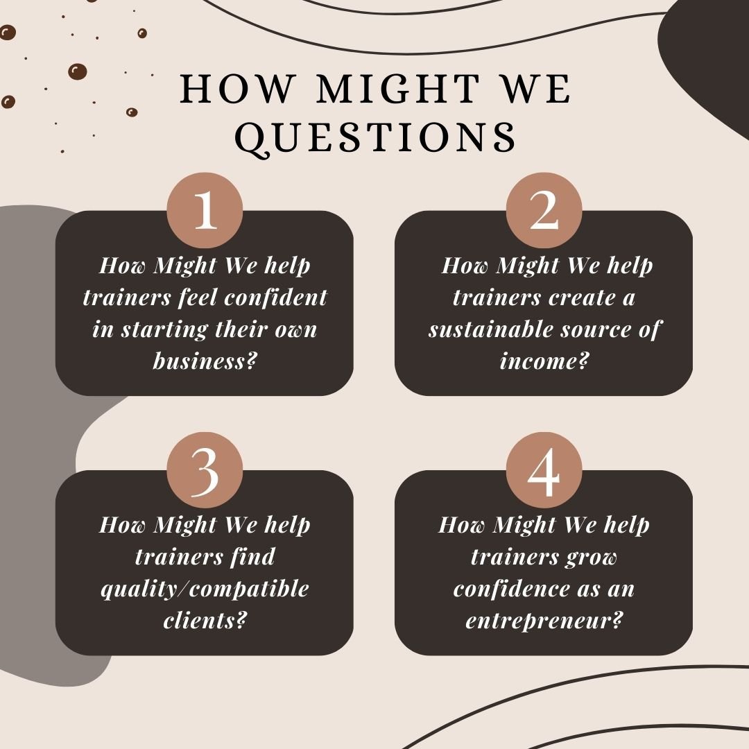
Project Plan

Target Audience (Expert side)
~ Personal trainers
~ Sports performance coaches
~ Coaches

Competitive Analysis
To better understand the industry and needs of both trainers and clients, we researched similar companies including Virtuagym, PTDistinction, Send Me a Trainer, and TrainerFu. We organized features each company offered in the following graphic:
Competitors:
Virtuagym
PTDistinction
Send Me a Trainer
TrainerFu
User Surveys
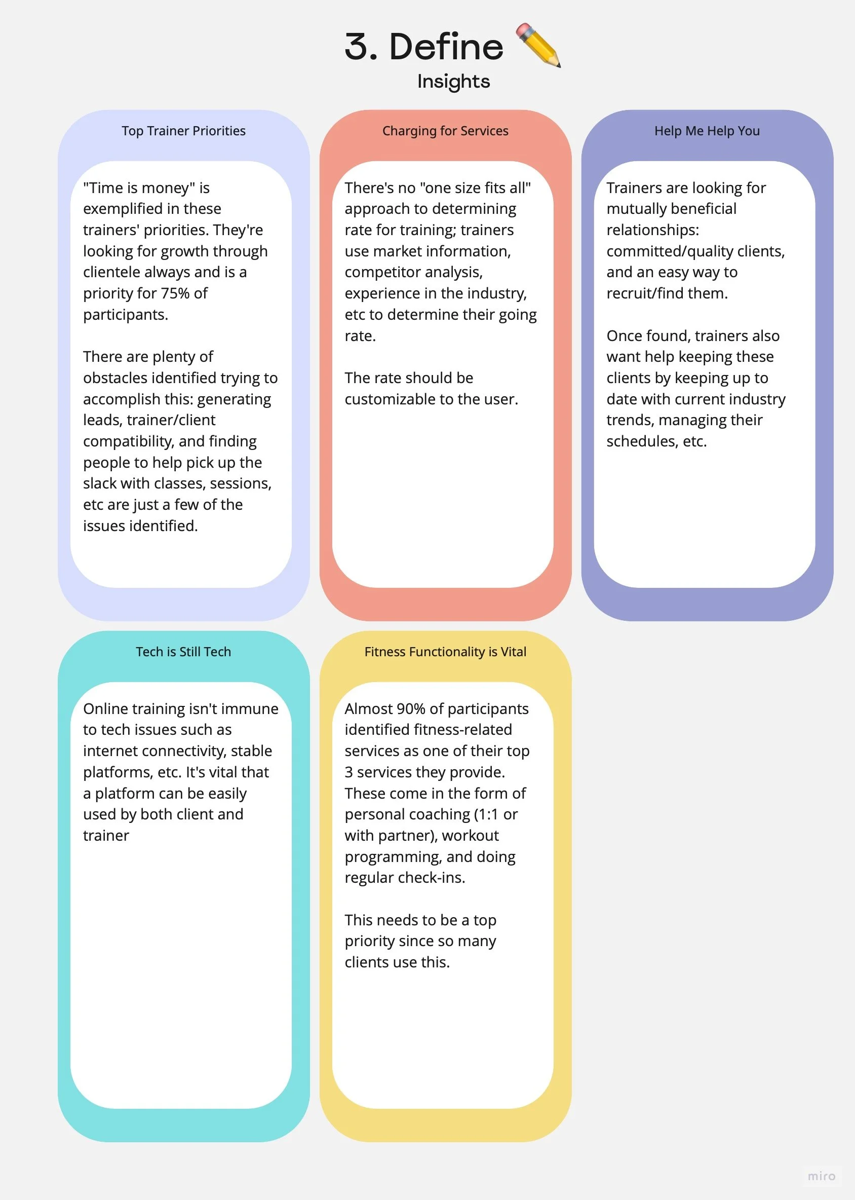
To gain a deeper understanding, we created an initial survey for potential trainers. The goal of this survey was to determine what frustrations and wishes were the most common.

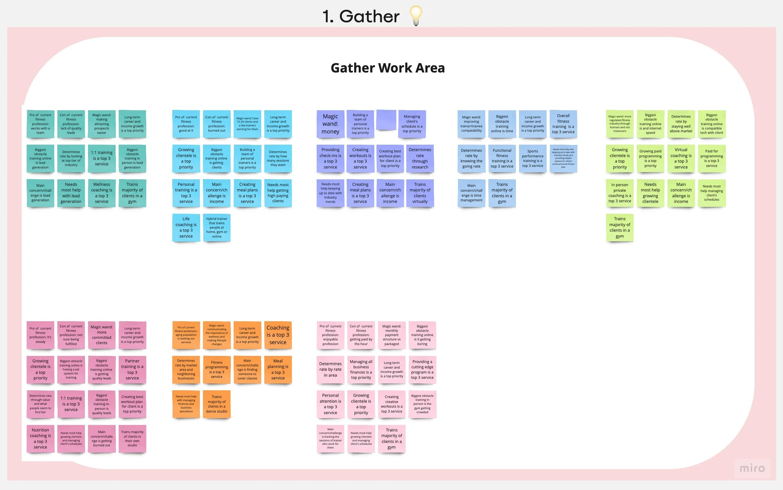
Affinity Map
After the conclusion of our short survey period (3-5 days), we began to gather important information. Much of the surveys showed potential trainers with similar mindsets and frustrations.
Persona
With the gathered research, we created a user persona that best matched our research. We developed this persona with the general trainer population in mind.

User Stories
Once our data was compiled, we wanted to create a more cohesive user story. The goal of this exercise was to understand exactly what users would encounter on their journey and the possible thought processes.

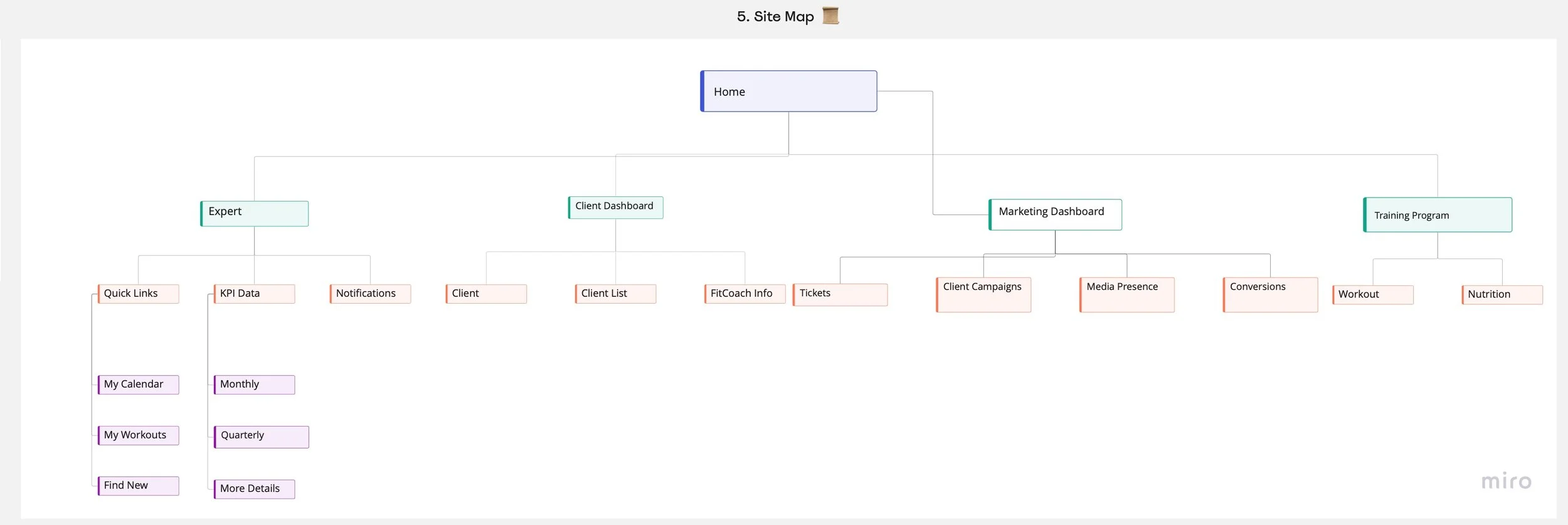
Site Map
For a better holistic picture of the scope of our project, we developed a sitemap.
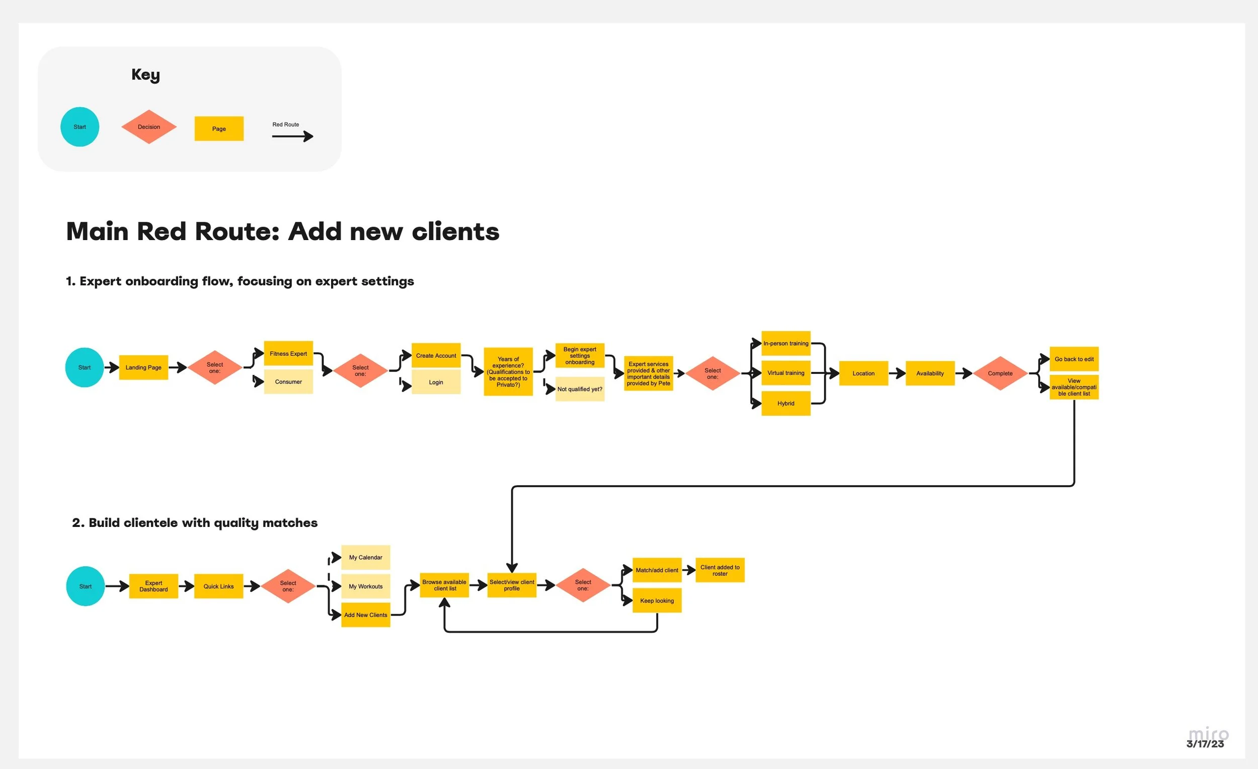
User Flows
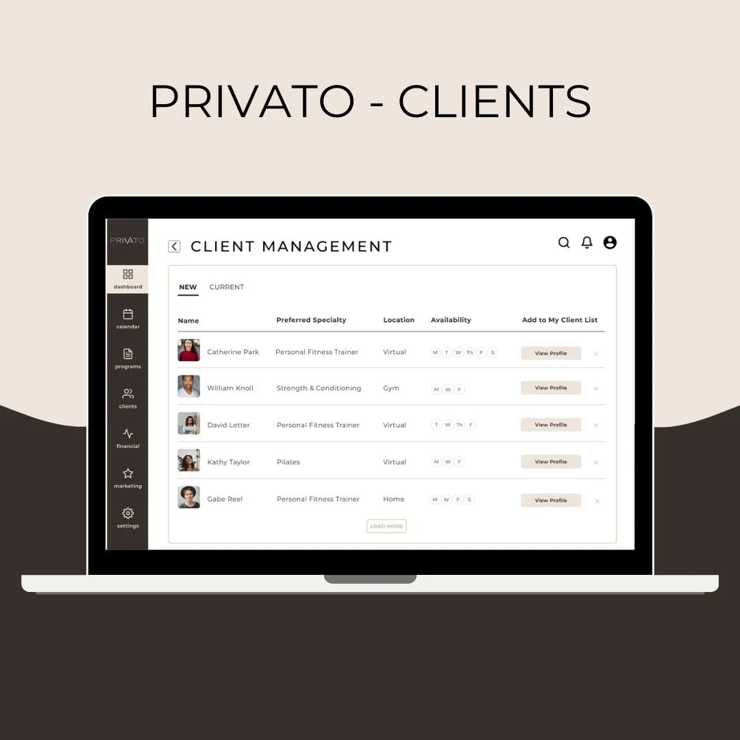
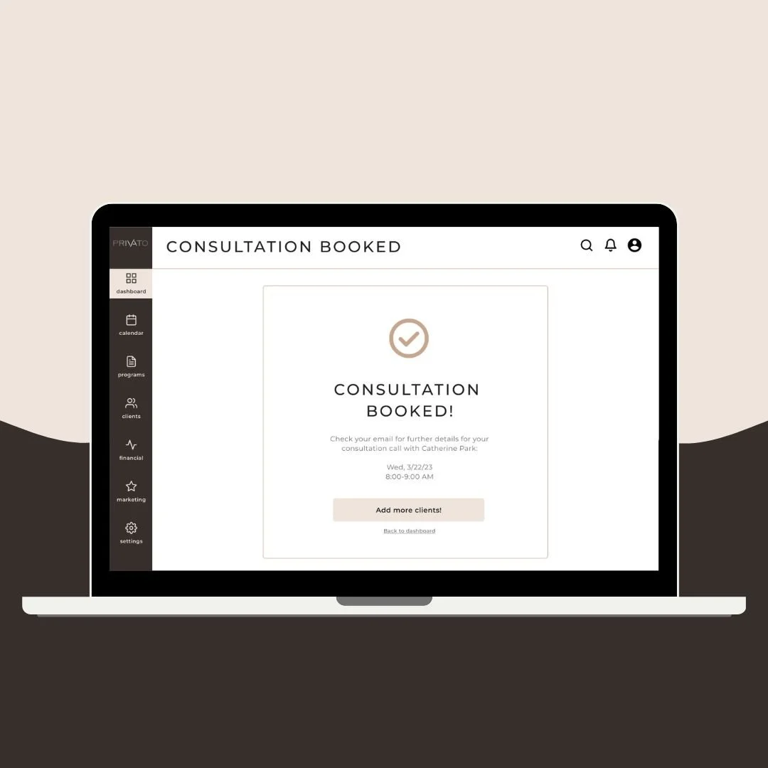
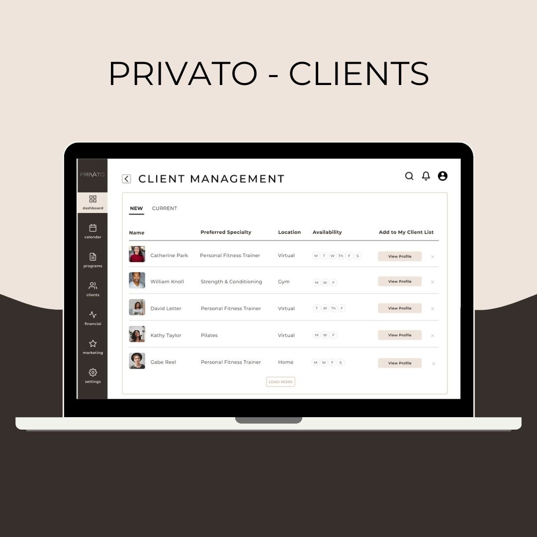
In the beginning of the process, we created four red routes to help solve our problem. We looked towards adding new clients, accessing an interactive calendar, accessing workouts, and managing clients.

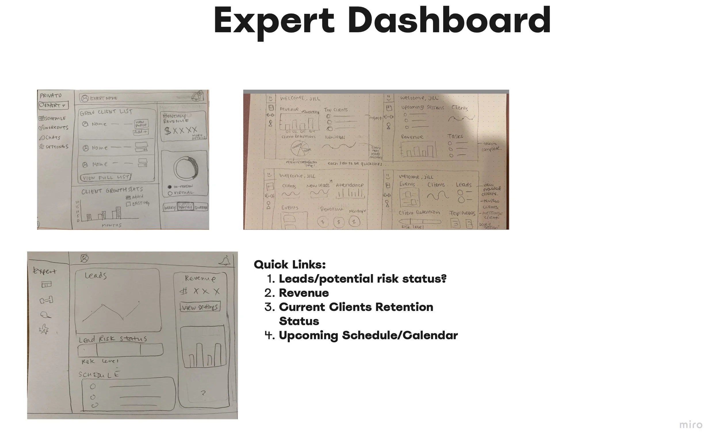
Sketches
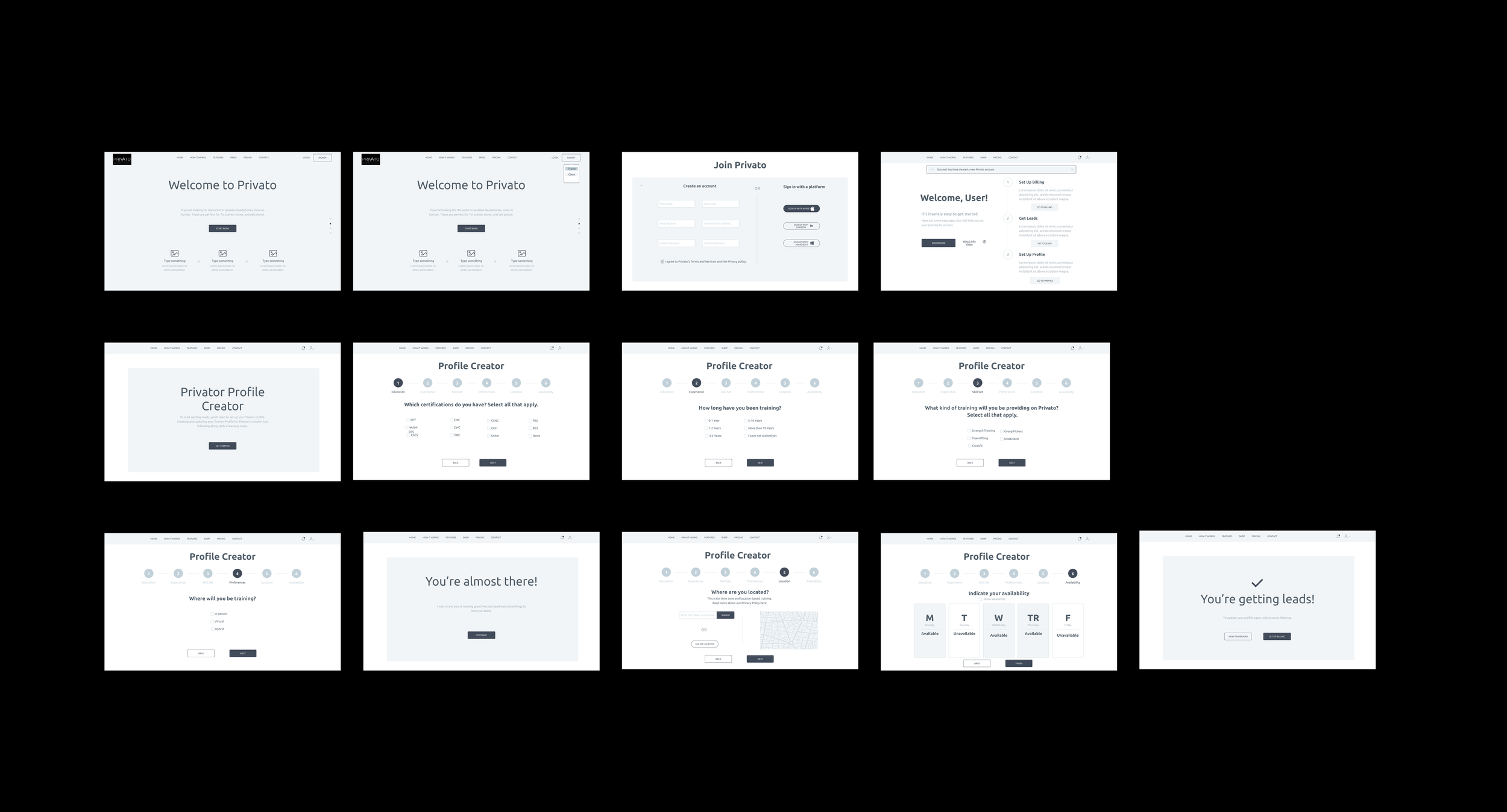
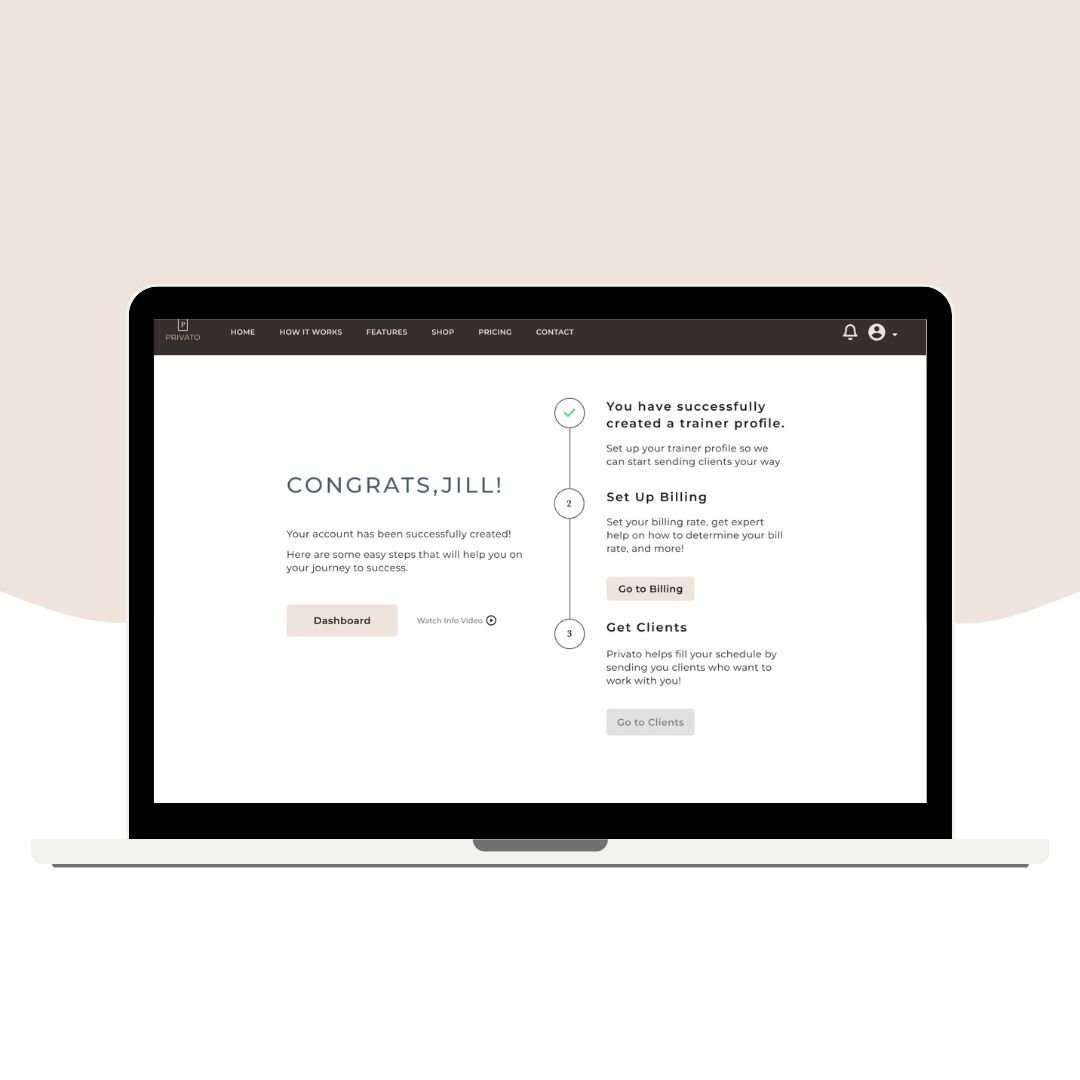
With our research conducted, we began to sketch out possible screens. After speaking with our stakeholder, we determined an onboarding process needed to be included in our project.

Wireframes
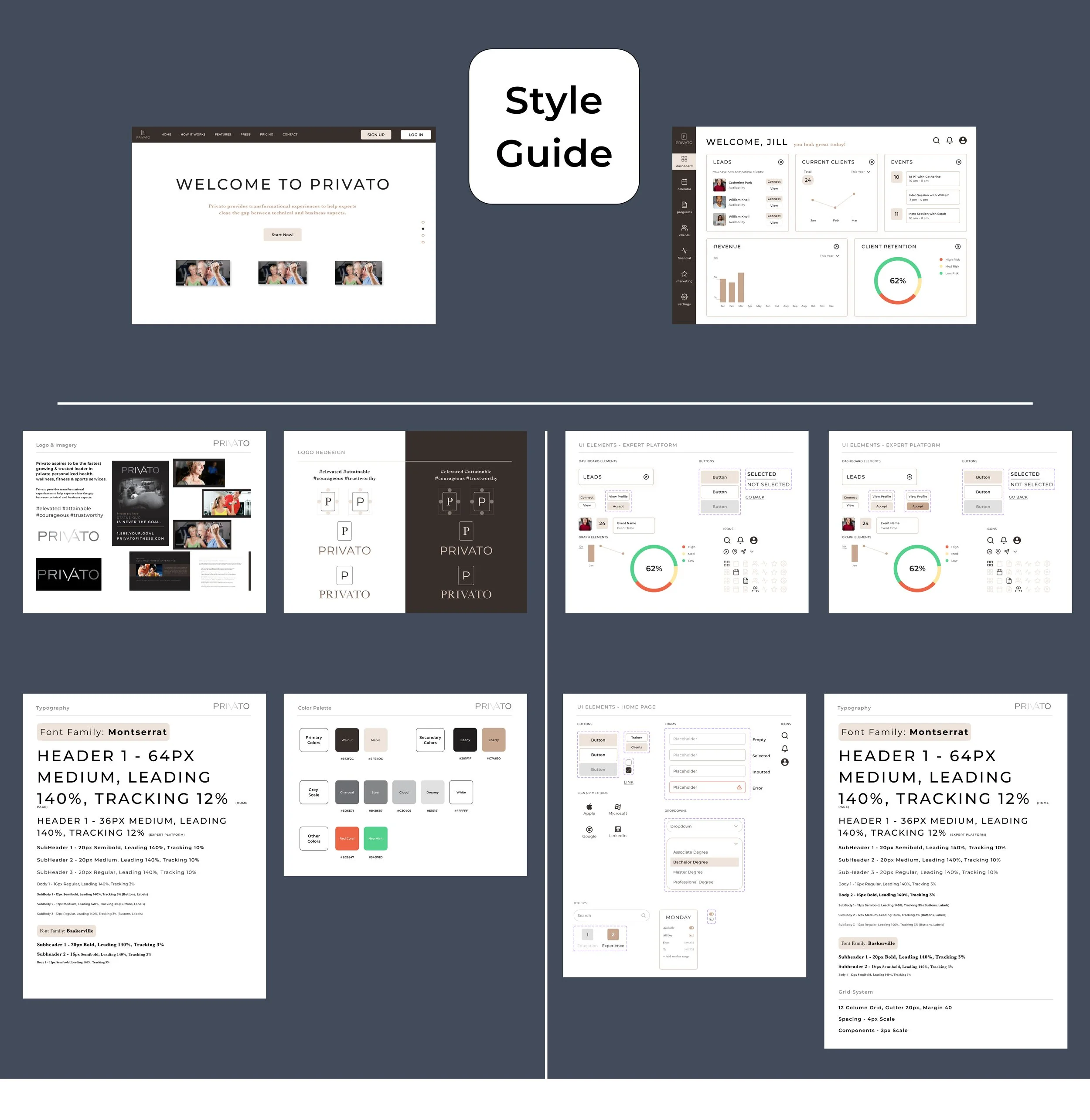
After the initial sketches, we began to do initial low fidelity wireframes. During this process we did not initially develop a style guide. As we continued on, we slowly started to develop a working style guide.


Style Guide

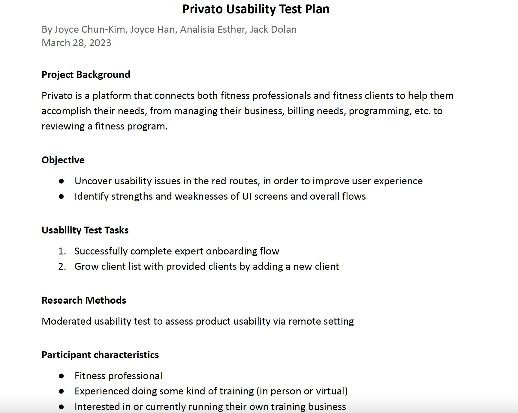
Usability Test Plan
For organizational and clarity purposes, we developed a testing plan to follow. This is to ensure we are asking all necessary questions and are can implement time management practices.

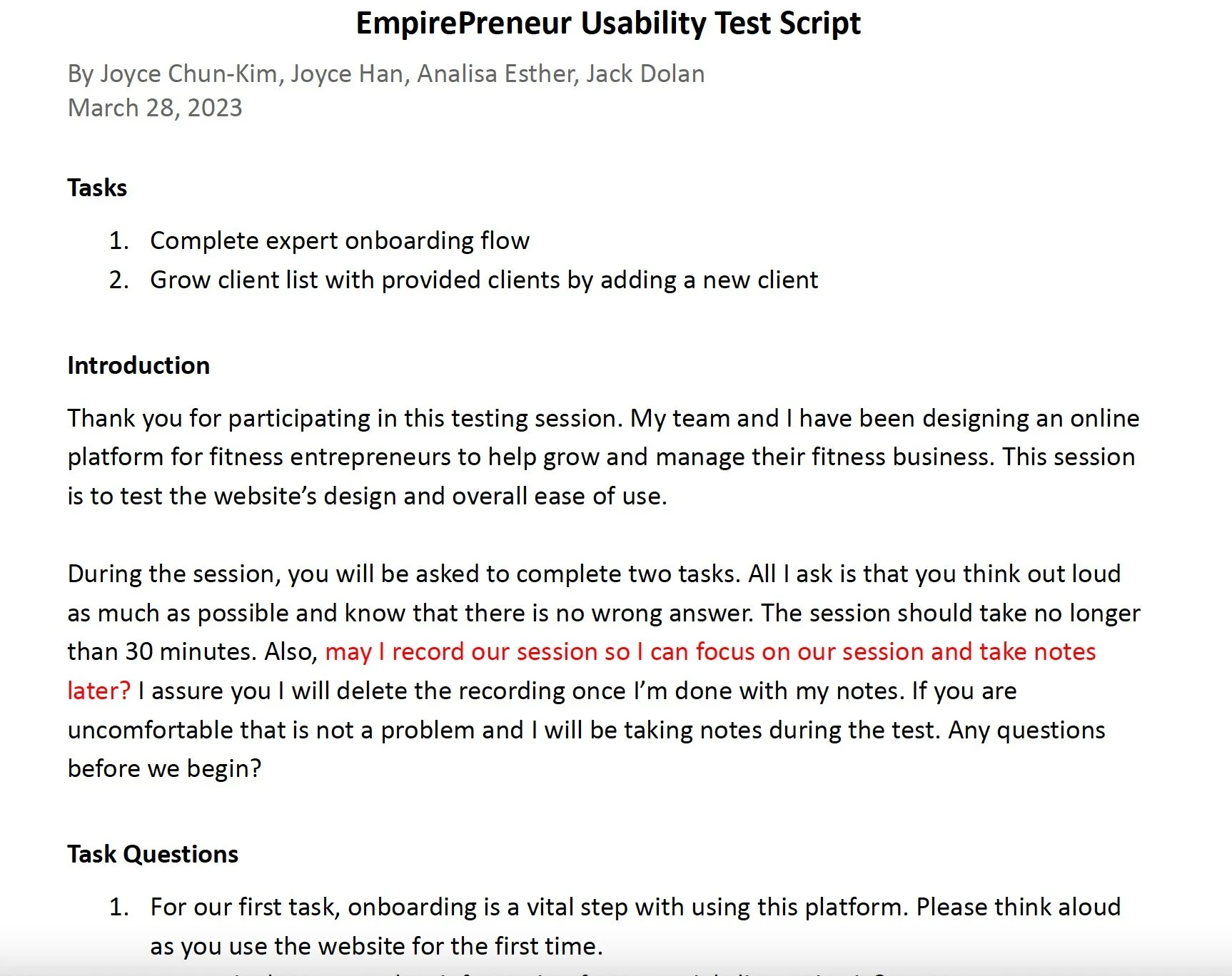
Usability Test Script
We developed a test script to follow to ensure a smooth interview and that we collected all necessary information needed to complete next round iterations.
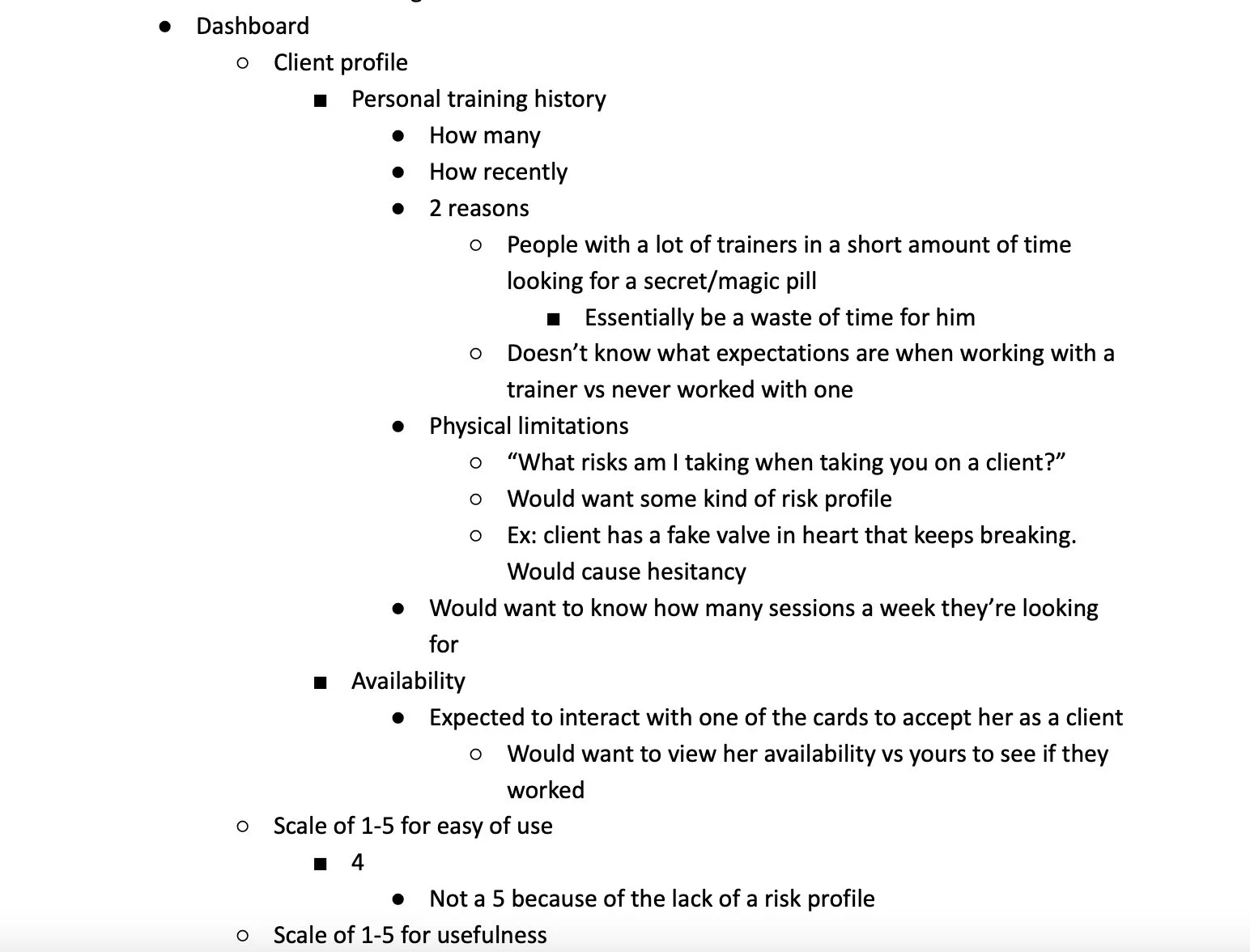
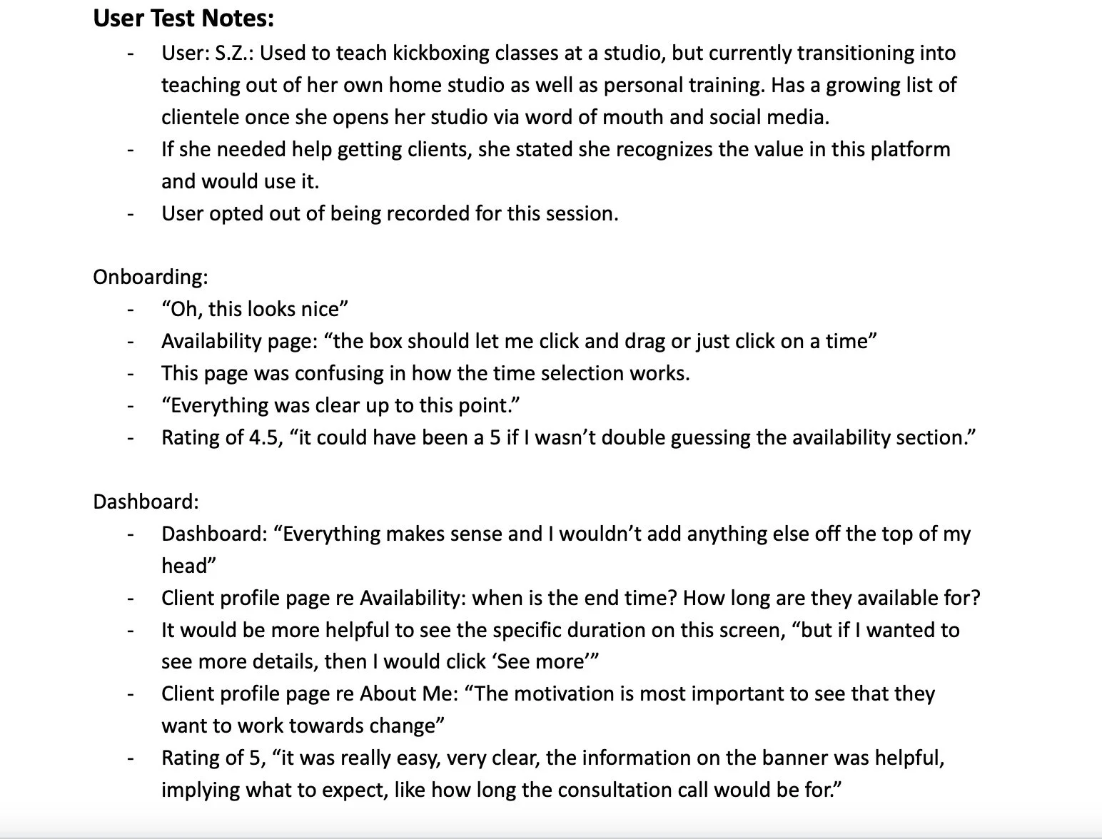
Usability Test Notes

High Fidelity Screens
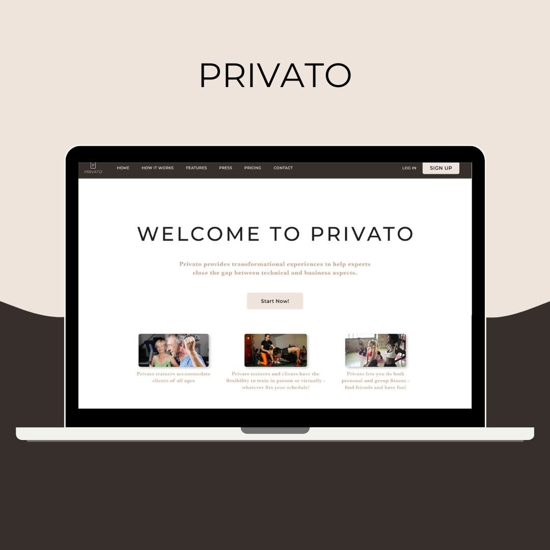
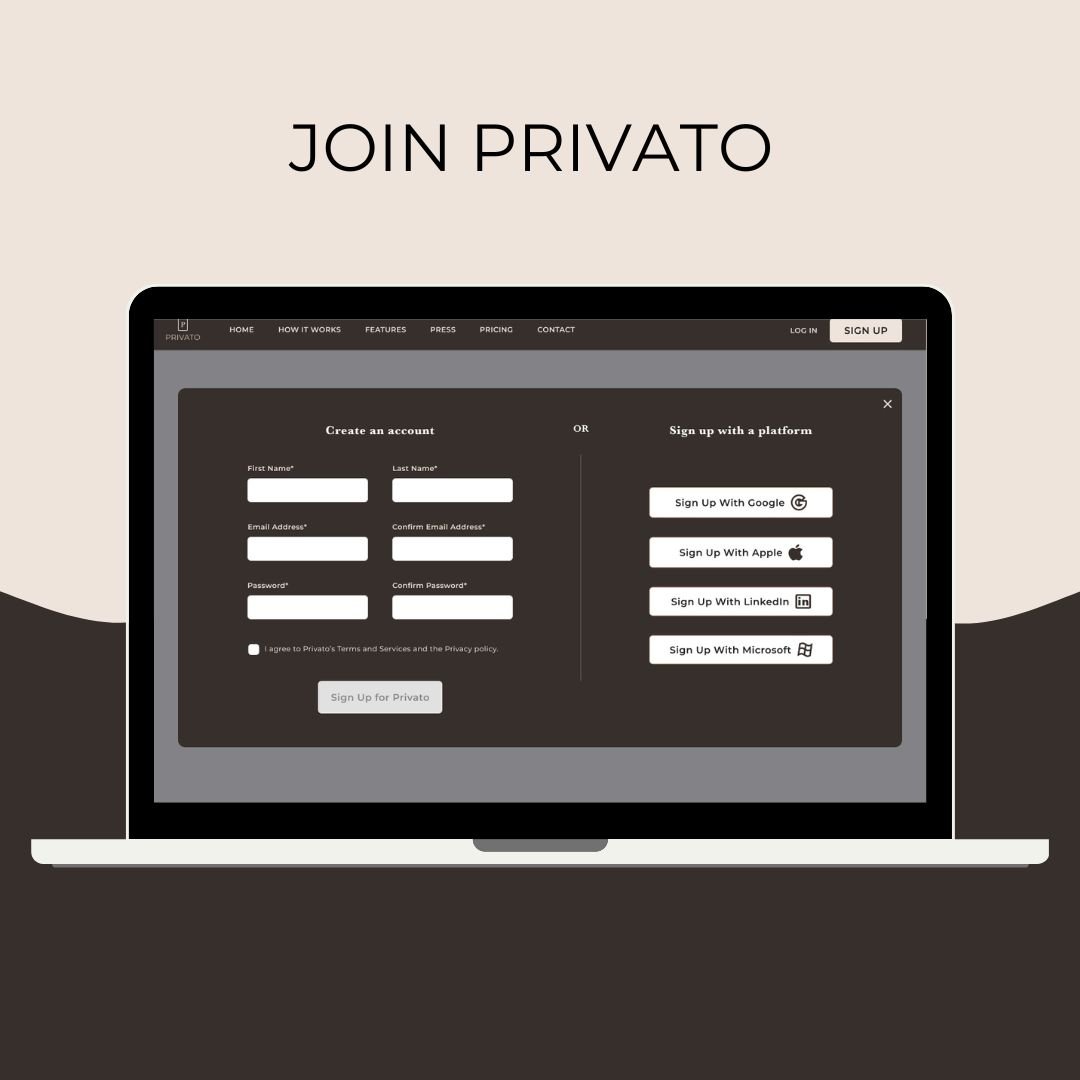
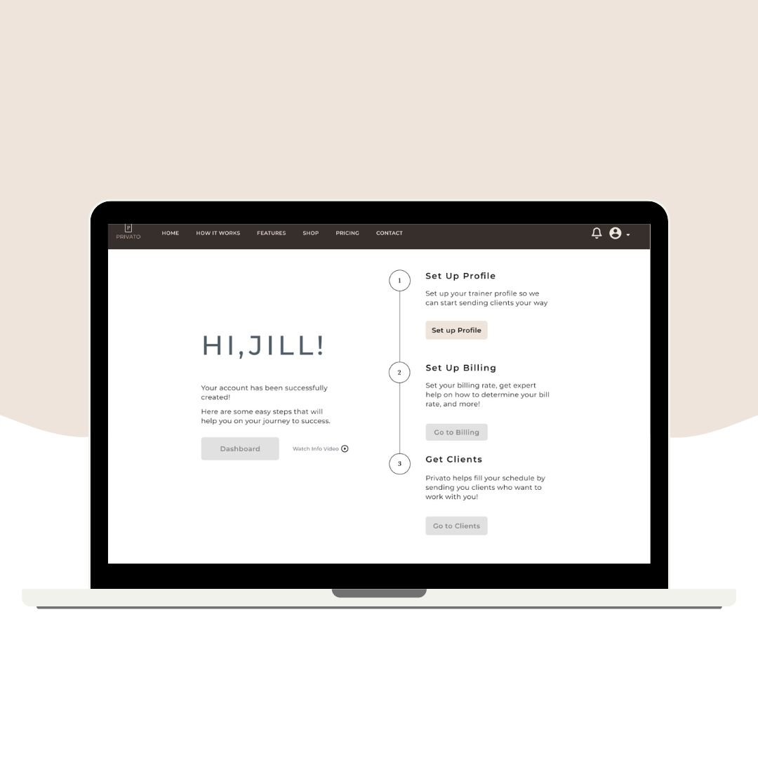


User Feedback
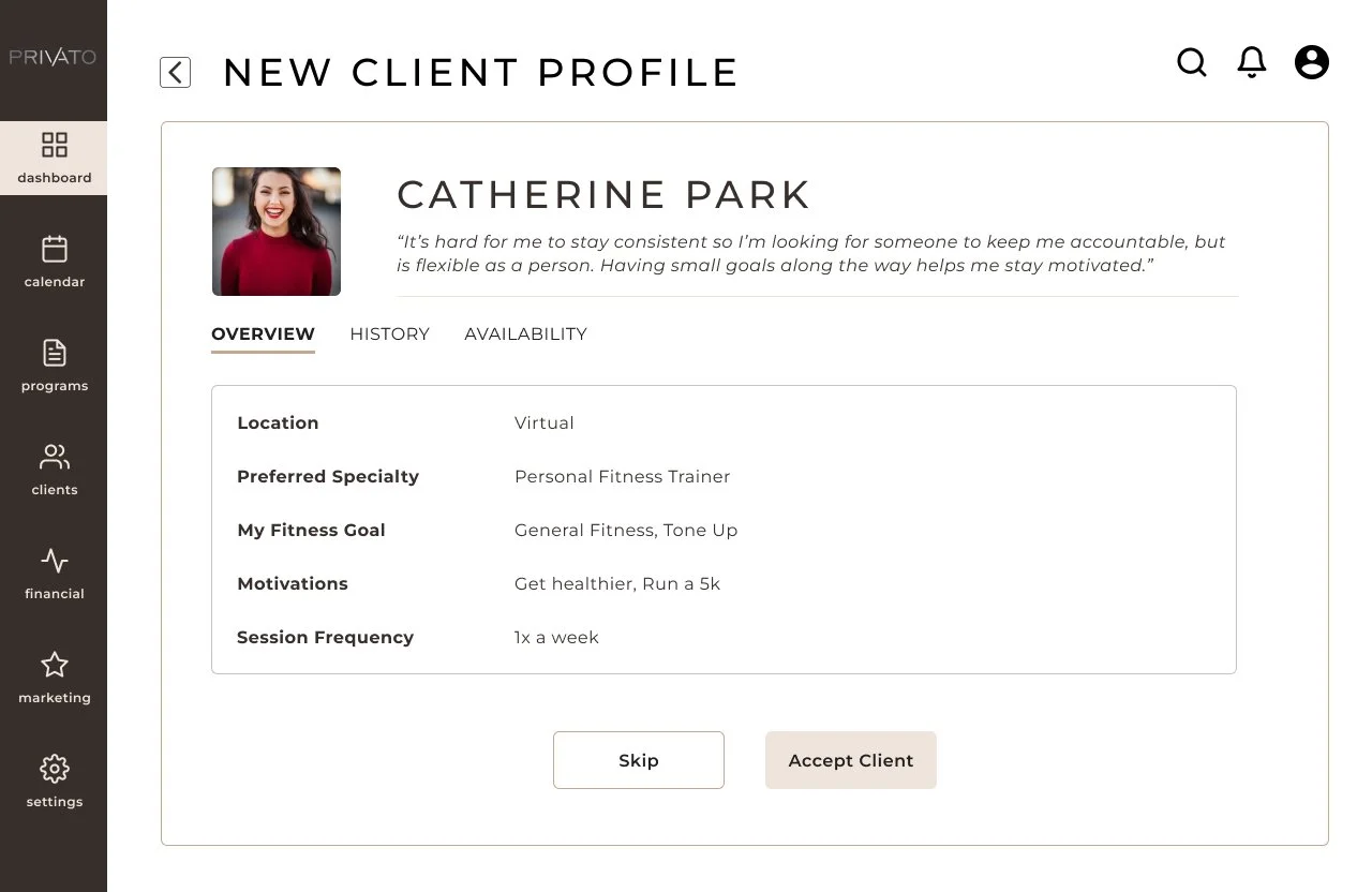
After reviewing the notes from the usability test, we decided to implement the following changes:
Modify Client Screen
We simplified the client screen to include only necessary text and removed the availability portion. A majority of users were confused and frustrated by this non-interactive element.
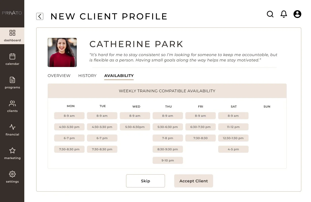
Add availability tab
We removed the availability portion from the main client page to ease user frustrations. We created a separate tab location for availability. As an option, we also provided the shareholder a screen without the availability tab.
BEFORE
AFTER
ADDITIONAL SCREEN
Final Thoughts
The entire process of working with this amazing team was one I’ll never forget. I really enjoyed collaborating and developing a workable solution to the problem. If there was more time for the project, I’d like to have work on the client side, conducted more usability tests with 3-5 more users, and did more secondary research.

