GalleryPal
A museum experience tailored just for you.
Duration
5 Day GV Design Sprint
Role
Product Designer
Tools
Figma & Marvel
Problem
The problem the company wants solved is increasing customer satisfaction. They want to implement the use of an app to increase user happiness and develop a better overall museum experience.
Solution
By providing users the opportunity to learn more about pieces in their gallery visits through interactive tools they have a more positive gallery experience.
Understanding My Role
As the sole product designer, I was responsible for sketching possible solutions, designing a prototype and conducting usability testing. The work was completed in five days.

Day 1:
Understand & Map
Understand the Brief
To gain a deeper insight on the experience of viewing art, I reviewed an interview with Lina Carol, a seasoned tour guide at the Museum of Natural History in New York. Afterwards, I took a second look at the user interviews and developed the singular persona of Angela.
User Persona:
After compiling the information from the user data, I created the following persona:
Angela
-
Angela wants to get quick information while looking at the art that will give her a better appreciation for it, and make her feel like she is making the most out of her visit.
-
Angela enjoys her visits, but feels like if she knew a little more, she would have a better experience. Angela has tried to read some books and articles on the art she’s seen, but loses interest due to how long and in-depth they are.
-
Since moving to New York a year ago, Angela has tried to take advantage of all the world class art and museums in the city. She goes to the more popular museums every couple of months - usually by herself. Angela doesn’t really look for specific exhibitions or artists - she just goes and browses whatever work is being showcased.
User Quotes
“I don’t need to know everything, I just don’t want to feel like I was missing out on something.”
“I enjoy going to the museum, but I often leave feeling like I didn’t appreciate the art to its full potential.”
How Might We Questions
-
How might we increase positive user experiences in a gallery?
-
How might we cultivate a sense of what users’ favorite pieces are?
-
How might we make learning about exhibits easier?
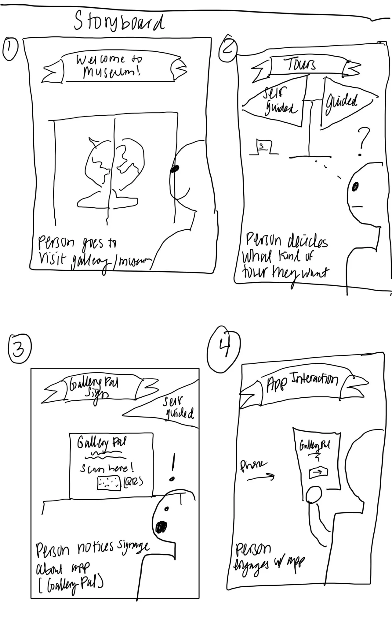
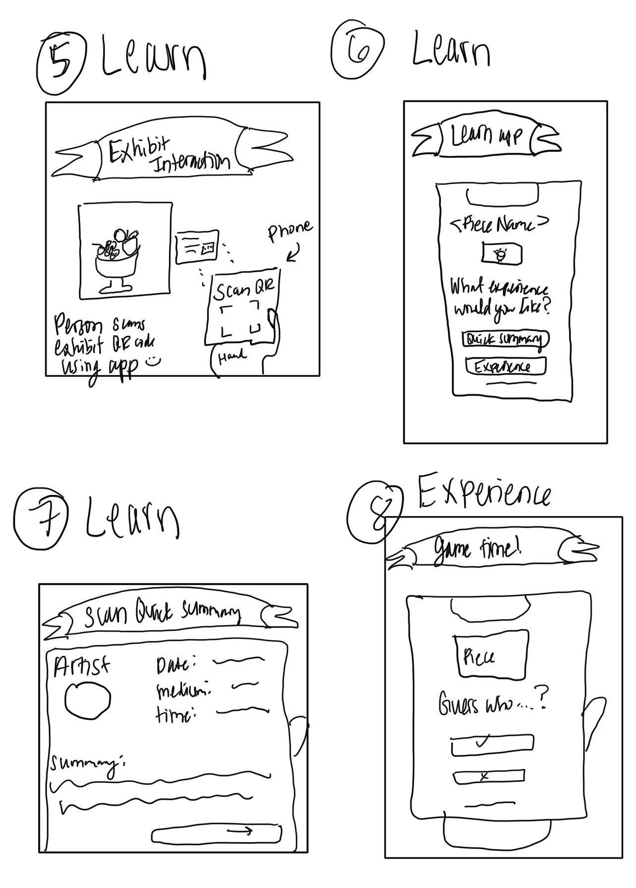
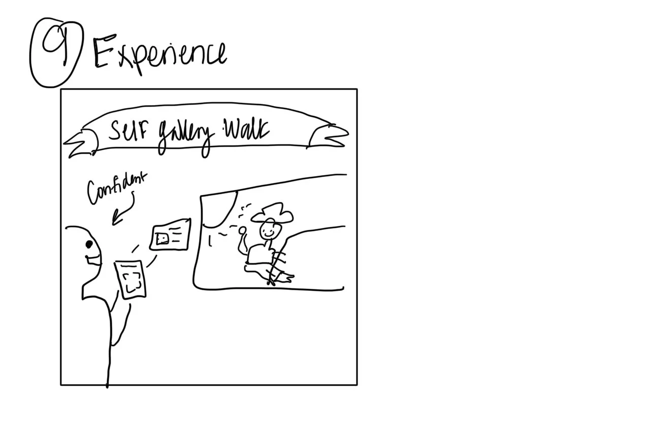
Using provided information, I developed a potential end-to-end user experience while using GalleryPal.

Day 2:
Lighting Demos & Sketching
Competitive Analysis
Once I understood my user’s goals, behaviors, and frustrations, I began to look at current industry examples. I researched current museum and gallery apps and popular artist pages. Here are a few highlights from my findings:
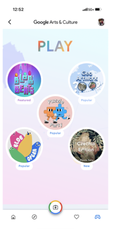
Google Arts & Culture
The Google Arts and Culture app allows anyone to explore museums and exhibits from anywhere in the world. The app is organized in various ways and is more tailored to user views. There are categories by artist, medium types, time periods, and more.
I looked at the app’s “interactive experience” in which users choose how they want to view different pieces.
Elements I would like to include:
→ Users selecting their choice of gallery experience
→ Brief summary (1-3 sentences) of the work with a picture of the work
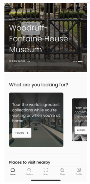
Smartify
The Smartify app allows people around the world to view art, learn more about artists, view select pieces, and more. The app is organized by featured venues, tours, artists, places, and shop.
I looked at the app’s “What are you looking for” in which users can narrow down what type of experience they want and what they are specifically looking for.
Elements I would like to include:
→ Different tour options
→ Carousel features
Crazy 8’s
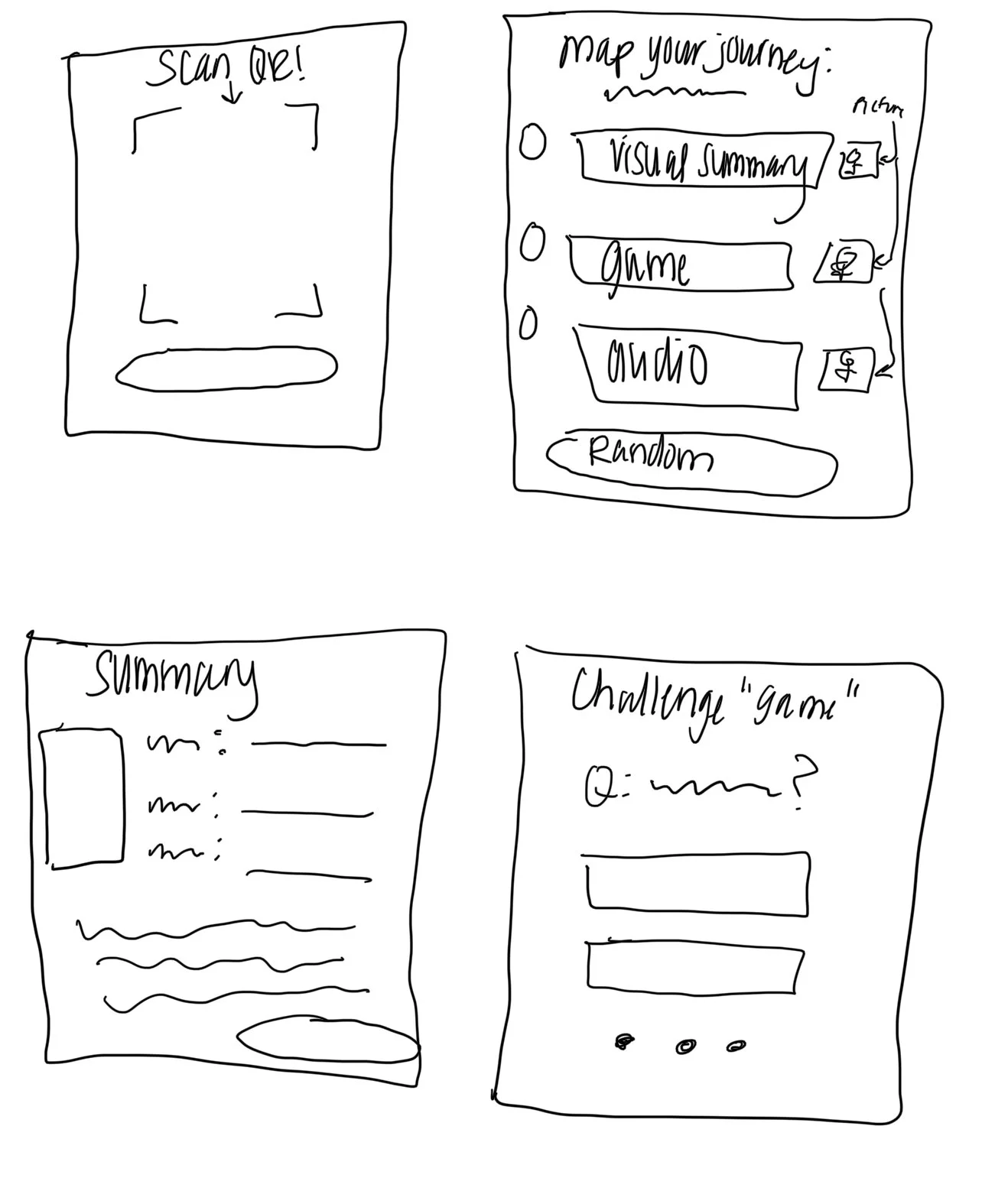
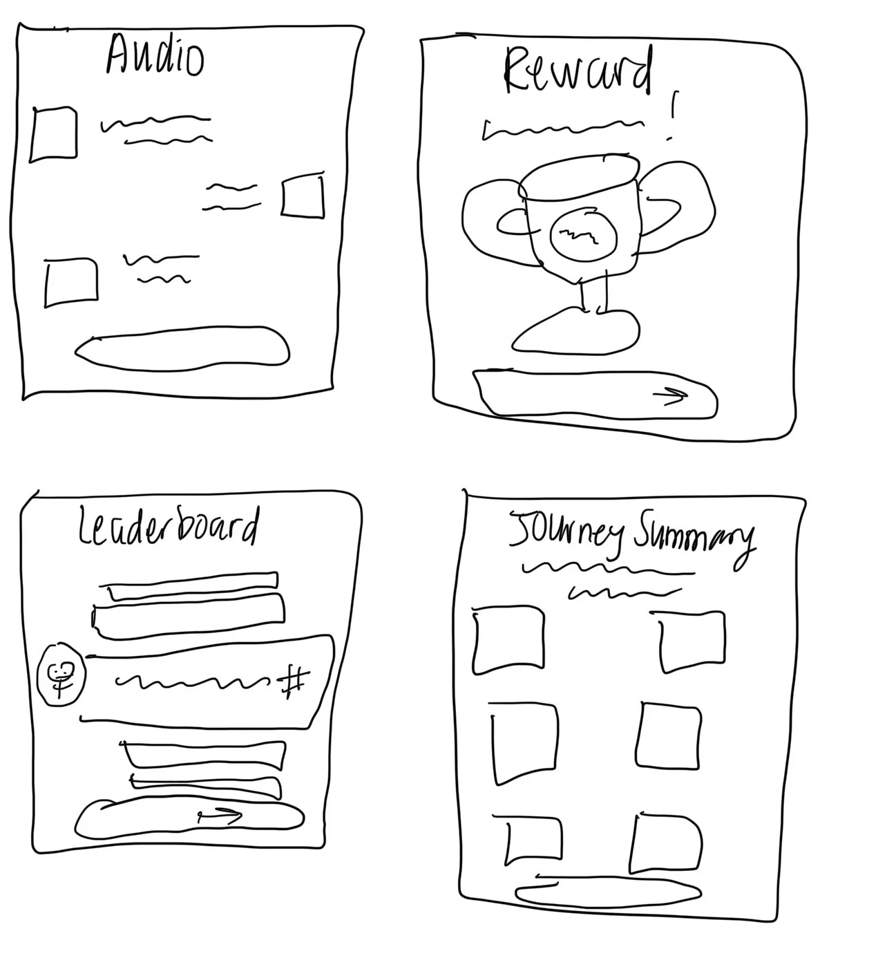
After gathering these insights, I conducted a Crazy 8s exercise to quickly ideate possible solutions for the GalleryPal App.
Here are a few of my sketches from a possible user journey:
Crazy 8’s Sketches

Day 3:
Create a Storyboard
Formatting My Storyboard
I decided to proceed with this solution due to the ease most users could use the app. It added simplicity and the ability for users to create their own experience, thus solving the main problem.
I imagined a new way to improve a gallery experience for users using some ideas from my lighting demos and my persona. I have identified two key phases.
-
This would deliver quick and digestible information on the exhibits and artists to users.
-
This provides users the option to gather and absorb information in an alternate version to the traditional summary. It also provides users a way to be engaged and present in their gallery visit.

Day 4:
Prototype
GalleryPal Prototype
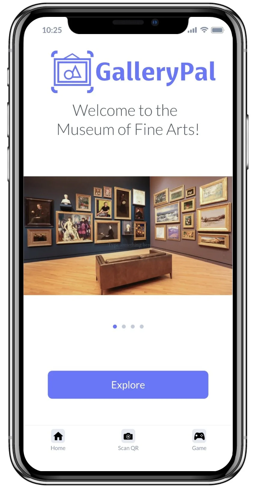
I chose to prototype using Marvel, since it was a recommended app that can generate design fairly quickly and produce great results. Using the personas, HMWs, and sketches, I focused on providing users with information regarding the different works in a gallery and allowing users to interact with exhibits.
Regarding the process, I am glad I decided to use Marvel, as it allowed me to swiftly create high-fidelity screens with smooth screen transitions and interactable objects. While some screens were more of a challenge to design than others, the time constraints forced me to choose a design and stick with it, rather than iterating on possible ideas

Day 5:
Testing
Interview Process
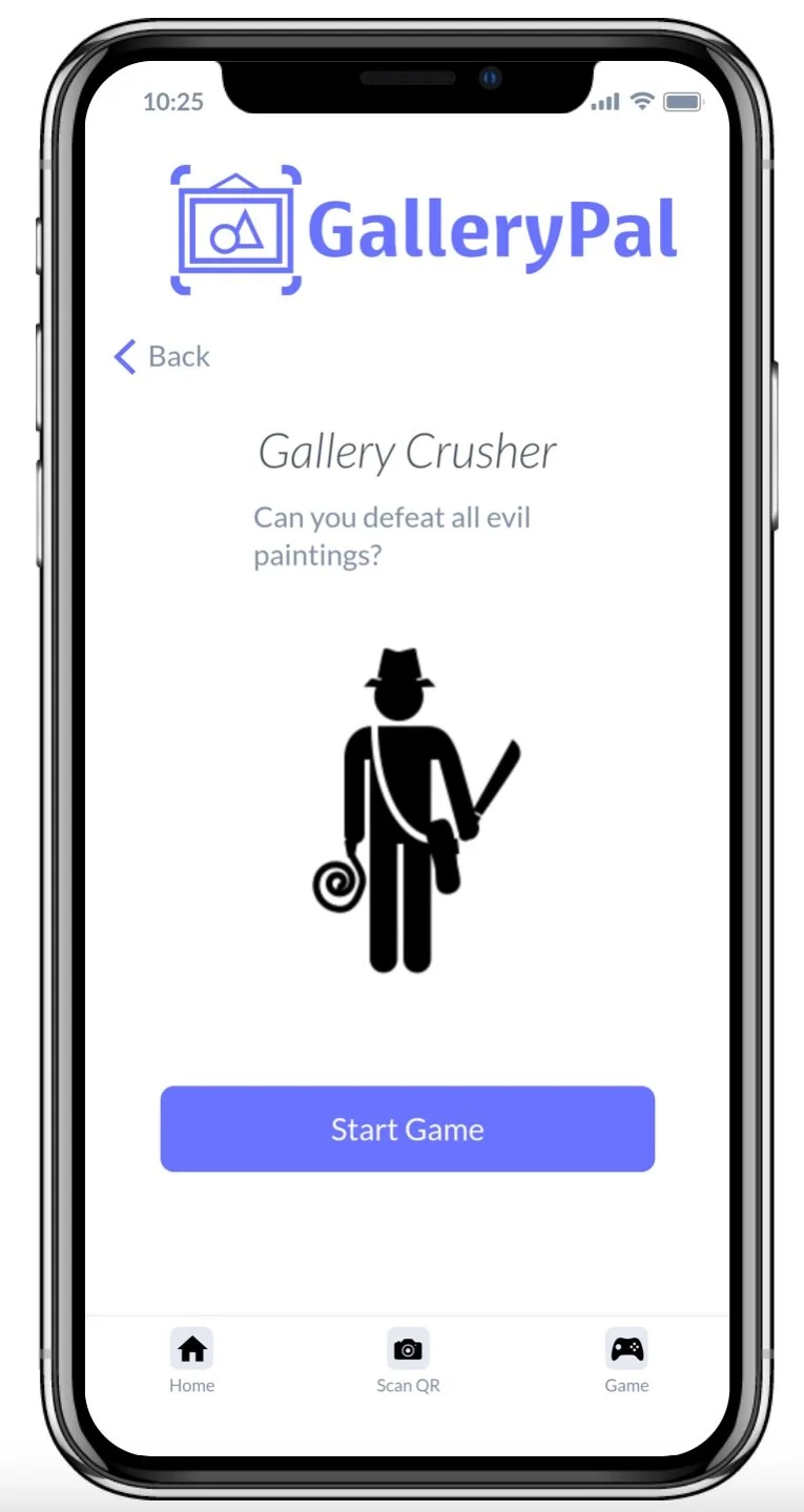
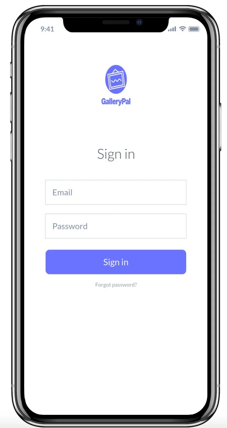
For interviews I recruited 5 people from throughout the community who have expressed interest in the arts. Each interview was 35 minutes, with five minutes being an introduction. Participants were asked to create an account and identify ways to learn more about an exhibit by exploring the app. Participants were tasked with launching a game to learn more about an exhibit and scanning a QR code to learn.

Testing Results
All five participants wanted more screens to dive into learning more about the works. Three users wanted a more in depth look at how the game would function. One user stated they enjoyed the overall clarity of the design.
Five users mentioned they could not scroll or swipe on the homepage where there were indicator buttons. Two participants mentioned the sign in and sign up buttons were too similar.
Overall Summary
After compiling the participant feedback, I began to implement some changes. I made sure to include an extra screen to view information about the art piece as well as changing the sign in and sign up button color choices.
Conclusion
If I had more time I would rework the camera page to include a real visual. I would also restructure the information layout of the learn more information page.
Takeaways
I learned that design sprints are much faster than normal projects and have more clear expectations. I enjoyed having more restrictions and a more clear vision of what users could possibly need. I would like the sprint to be longer and collaborate with others.

